Instant Connection for Pixel Streaming
— New Feature Automated Setup

Best AI Presentation Tools in 2026: What Actually Works
Best AI Presentation Tools in 2026: What Actually Works
Freelance
Best AI Presentation Tools in 2026: What Actually Works
Table of Contents
Last year, I spent 6 hours building a pitch deck. This year, I typed two sentences and got something usable in under two minutes.
That shift is real. And it’s not just me.
AI presentation tools have quietly become very good at handling the worst parts of slide creation. The blank slide. The formatting. The “how do I structure this?” moment. You give them a rough idea, and they’ll turn it into a full outline, designed slides, even suggested visuals. It’s not perfect. But it’s fast. Really fast.
I’ve seen teams cut what used to be half a day of work down to 20 or 30 minutes. Sometimes less, if they’re okay with a rough first draft. The combination of AI-generated content plus auto-layout design is doing most of the heavy lifting now. Titles, bullet points, image suggestions, even color consistency. All handled.
But here’s the part people don’t say out loud enough.
Most AI-generated decks are not ready to present.
They look fine at first glance. Clean. Structured. Even a bit impressive. But once you actually read through them, you start noticing the cracks. Generic phrasing. Weak transitions. Occasionally awkward logic. Sometimes it feels like the slides were written by someone who understands presentations… but doesn’t understand your presentation.

That’s the tradeoff.
You’re saving time on creation, but you still need to think. You still need to shape the story, adjust the tone, and fix the parts that don’t quite land. In my experience, the best results come when you treat AI as a starting point, not the final product.
And then there’s another issue.
Not all AI presentation tools are equal. Not even close.
Some are great at speed but fall apart when you need depth. Others produce beautiful slides that say almost nothing. A few try to do everything and end up being clunky to use. And the differences only become obvious after you’ve actually built a few decks with them.
So if you’ve tried one tool and felt underwhelmed, that doesn’t mean the whole category is overhyped.
It just means you probably picked the wrong one.
What These Tools Actually Do
If you’ve never used one of these tools before, the experience feels a bit strange the first time.
You type something like:
“Create a 10-slide presentation about renewable energy trends for investors.”
And within seconds, you get… a full deck. Title, sections, bullet points, even visuals. It almost feels like cheating.
Under the hood, most of these tools follow the same pattern:
You give them a prompt, a short brief, or sometimes a document
They generate an outline first
Then they turn that outline into slides with structured content and design
That’s the core loop. Fast input, structured output.
Where they really shine is in three areas.
First, outlining.
They’re surprisingly good at taking a messy idea and turning it into something that resembles a logical flow. Not perfect, but often better than staring at a blank slide for 20 minutes.
Second, first drafts.
You get something concrete to react to. Even if half of it is off, it’s easier to edit than to start from nothing.
Third, visual consistency.
Fonts, spacing, alignment, color palettes. The stuff most people struggle with. AI handles that quietly in the background, and honestly, that alone saves a lot of frustration.
But… there are limits. And they show up quickly if you push these tools even a little.

They don’t really “understand” your topic in a deep way. If your presentation requires nuance, original thinking, or strong opinions, the AI will default to safe, generic content. It sounds right, but it doesn’t feel sharp.
They also struggle with storytelling.
A good presentation isn’t just a sequence of slides. It has rhythm. Tension. A sense of build-up. Most AI tools don’t quite get that yet. They give you structure, but not always a compelling narrative.
And then there’s accuracy.
If your deck includes data, claims, or anything that needs to be correct… you still have to double-check everything. Always. I’ve seen AI confidently include outdated stats or vague claims that sound convincing but fall apart under scrutiny.
So yeah, these tools are fast. And useful.
But there’s a clear tradeoff happening in 2026.
Speed vs depth.
If you lean too hard on automation, you’ll end up with something that looks polished but says very little. If you step in and guide the process, though, you can get to a strong final deck much faster than before.
That’s the sweet spot.
The Shift in 2026: Presentations Aren’t Really “Slides” Anymore
Here’s something I didn’t expect a year ago.
A lot of the best “presentation tools” in 2026 don’t even feel like slide tools.
You open them, and instead of a classic slide canvas, you get something closer to a document… or a webpage. Content flows vertically. You scroll instead of click. Sections expand. Media plays inline.
At first, it feels wrong. Then it clicks.
Because most presentations today aren’t happening in a conference room.
They’re being:
Shared as links
Skimmed asynchronously
Viewed on laptops and phones
Revisited later, not just presented live
So the format had to evolve.
Tools like Gamma and Tome leaned into this early. Instead of forcing everything into rigid slide boxes, they treat presentations more like narratives you can explore, not just screens you click through.
And honestly, it solves a real problem.
Traditional slides were built for live speaking. One person talking, others watching. But now? A lot of decks are consumed without the presenter. That changes everything.
You need:
Clear flow without narration
Strong visual hierarchy
Content that stands on its own
This is where newer AI tools actually shine.
They’re not just generating slides. They’re generating structured reading experiences. Headings that guide you. Sections that feel connected. Layouts that don’t fall apart when you scroll.

Of course, this isn’t always a win.
If you’re pitching to investors in a formal setting, or presenting in a boardroom, traditional slides still matter. Linear flow. Tight control. No surprises.
And some of these newer formats can feel a bit… loose. Great for exploration. Not always great for precision.
So now you’ve got two directions:
Classic slide tools, enhanced with AI
New AI-first tools that rethink the format entirely
Neither is “better” in a universal sense.
It depends on how your presentation is actually going to be used.
And that’s where most people make the wrong choice. They pick a tool based on features, not context.
In my experience, the format matters just as much as the content. Maybe more.
The Best AI Presentation Makers in 2026
I’ve spent the past few months testing most of these. Some impressed me right away. Others looked great in demos and then fell apart after two real presentations.
Here’s the honest breakdown.
1. Gamma
If your goal is speed, Gamma is hard to beat.
You type a prompt, hit generate, and within seconds you’ve got a full structure with clean, modern layouts. It doesn’t try to mimic PowerPoint. It leans into that scrollable, web-style format we talked about earlier.
What I like:
Extremely fast first drafts
Clean, readable layouts out of the box
Feels modern without trying too hard
What I don’t love:
Content can feel generic pretty quickly
Limited control if you want pixel-perfect slides
Exporting to traditional formats can be a bit messy
I use Gamma when I just need to get something out of my head and into a presentable shape. Internal updates, rough ideas, early drafts. It’s great for that.

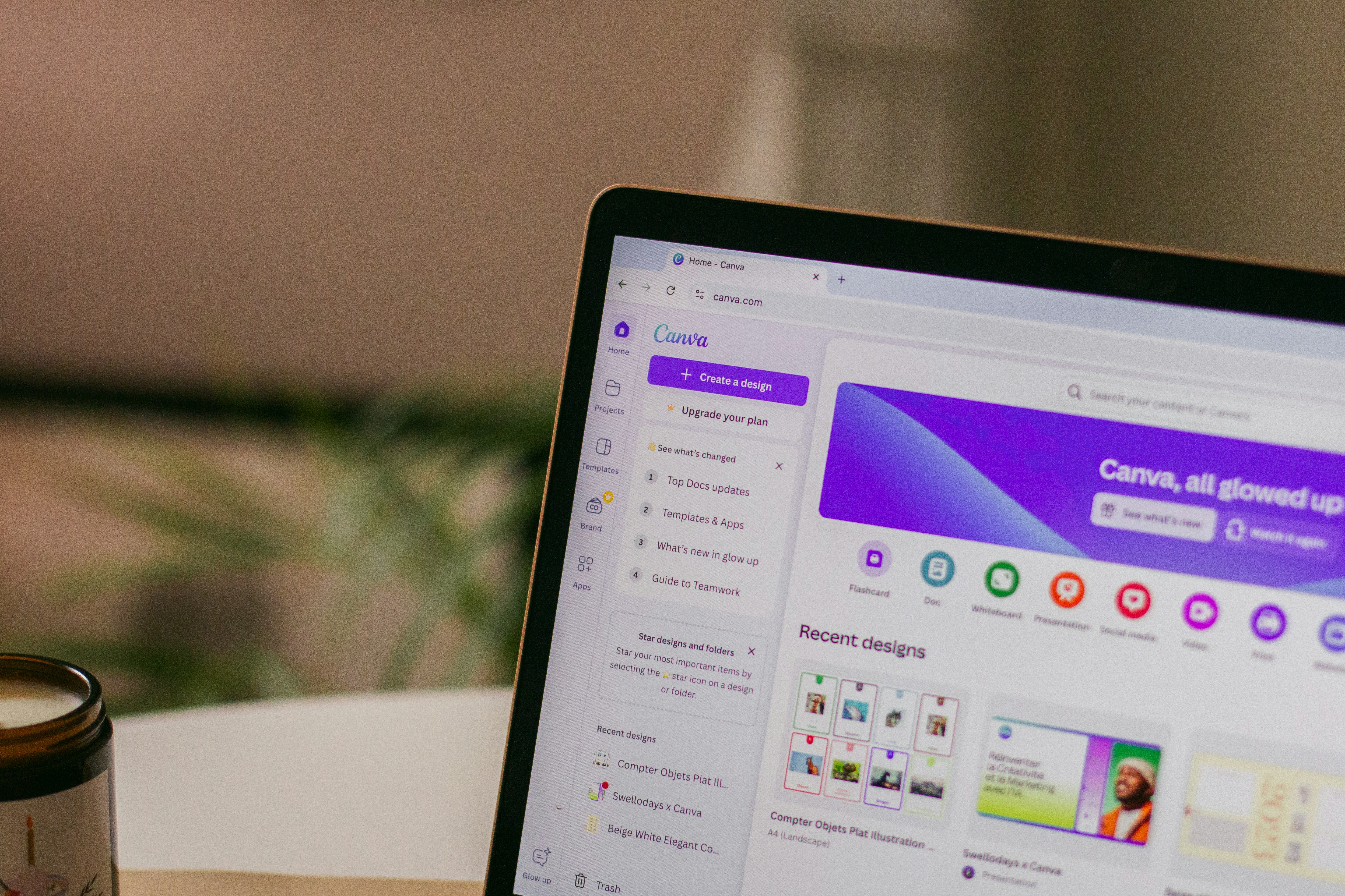
2. Canva AI
Canva has quietly become one of the strongest options here.
Their AI features, especially Magic Design, can generate full presentations that already look polished. Not “AI polished.” Actually polished.
What stands out:
Huge template and asset library
Strong brand consistency tools
Easy to tweak visuals without breaking everything
Where it struggles:
The writing is often surface-level
You’ll almost always need to rewrite key slides
In my experience, Canva is the best choice if visuals matter more than content depth. Marketing decks, social content, anything where design carries the message.
3. Tome
Tome feels different from the moment you open it.
It’s less about slides and more about flow. You’re building a narrative, not just stacking bullet points.
What it does well:
Great for storytelling and product narratives
Supports rich media and embeds naturally
Feels more like a story than a deck
Downside:
Less control over traditional slide structure
Not ideal for formal or corporate settings
I reach for Tome when I want a presentation to feel engaging, not just informative. Product demos, creative pitches, anything where flow matters more than format.

4. Prezi AI
Prezi has been around forever, and somehow it’s still relevant.
Their AI layer now helps generate content and structure, but the core experience is still that zoomable canvas.
Why people still use it:
Visually dynamic and engaging
Great for explaining relationships between ideas
Memorable when done well
Where it falls short:
Can feel gimmicky if overused
Not great for data-heavy or formal decks
Prezi works best when you’re teaching or explaining something complex and want people to actually stay awake.

5. Plus AI
Not everyone wants a new tool. I get that.
Plus AI plugs directly into Google Slides (and PowerPoint), which means you don’t have to change your workflow at all.
What it gets right:
Works inside tools you already use
Generates and edits slides in place
Easy for teams to adopt
Limitations:
Less visually innovative
Feels more like an upgrade than a reinvention
If you’re working in a team or corporate environment, this is probably one of the safest choices.

6. Beautiful.ai
Beautiful.ai focuses on something most tools ignore.
Structure.
It helps you build slides that make sense visually, especially when you’re dealing with charts, numbers, and comparisons.
What stands out:
Smart layouts that adapt to your content
Strong for data-heavy presentations
Keeps everything aligned and clean
Where it’s weaker:
Less creative freedom
Can feel a bit rigid
I wouldn’t use it for storytelling. But for reports or analytics-heavy decks, it’s one of the better options.
7. Presentations.AI
This one feels very… intentional.
Instead of just generating slides, it tries to guide you toward persuasive structure. Think sales decks, investor pitches, anything where the goal is to convince.
What I like:
Strong focus on messaging and flow
Good export and sharing options
Feels built for real business use
What I don’t:
Less flexible creatively
Not as fun or exploratory as tools like Tome
If your presentation has a clear goal, like closing a deal, this tool makes more sense than most.

The smaller players
There are a few others that don’t get as much attention but still matter depending on your use case.
Pitch → great for collaboration-heavy teams
Slidebean → popular with startups for fundraising decks
Visme → strong for interactive and data-driven content
None of these are “the best” overall. But in the right context, they can be exactly what you need.
If there’s a pattern here, it’s this:
There is no single best AI presentation tool anymore.
There’s just the one that fits how you work.
And that’s where things start to get interesting.
What Nobody Tells You About AI Presentations
Here’s the part most blog posts skip.
AI doesn’t actually remove the work. It just moves it.
Instead of spending hours building slides from scratch, you spend your time fixing, shaping, and questioning what the AI gives you.
Sometimes that’s faster. Sometimes… not as much as you’d expect.
You’re still going to rewrite more than you think
The first draft always looks decent.
Then you start reading.
And you notice things like:
Repetitive phrasing across slides
Vague statements that sound right but say nothing
Sections that don’t quite connect
This happens a lot. Especially with longer decks.
In my experience, I end up rewriting at least 30 to 50 percent of the content if it’s something important. Less for internal stuff. More for anything high-stakes.
So if you’re expecting “click a button and present,” you’ll probably be disappointed.
AI is confident… even when it’s wrong
This one can get people into trouble.
If your presentation includes:
Market data
Trends
Numbers
Claims about competitors
You need to double-check everything.
AI tools are great at generating structure, but they’re not reliable sources of truth. They’ll include stats that sound believable, but might be outdated or completely made up.
I’ve seen people copy slides directly into investor decks without verifying anything. Risky move.

Everything starts to sound the same
After using these tools for a while, you start noticing a pattern.
A lot of decks begin to feel… interchangeable.
Same tone. Same structure. Same safe language.
That’s because most AI tools are optimized for “generally acceptable” content. Not bold opinions. Not sharp messaging.
So if you don’t step in and add your voice, your presentation will blend in with everyone else’s.
And in some cases, that’s worse than doing it manually.
Design is solved. Storytelling isn’t.
This is probably the biggest shift.
Design used to be the hard part. Alignment, spacing, colors. Now it’s mostly handled.
Which means the real challenge becomes:
Does this presentation actually make sense?
Does it build toward something?
Does it convince anyone?
AI won’t answer those questions for you. At least not yet.
The real workflow looks different than you expect
People imagine this:
Prompt → finished deck → done
What actually happens is closer to this:
Generate a draft with AI
Cut half of it
Rewrite key sections
Adjust visuals and flow
Then finalize
It’s still faster than starting from scratch. No question.
But it’s not magic.
If anything, AI presentation tools are best seen as thinking partners, not replacement tools.
They get you unstuck. They give you momentum. They handle the boring parts.
But the part that actually makes a presentation work?
That’s still on you.

How to Choose the Right Tool
Most people pick a tool the wrong way.
They compare features. Look at templates. Maybe watch a demo video. Then they pick whatever looks the most impressive.
And then… they stop using it after a week.
Because the real question isn’t “which tool is best?”
It’s “which one fits how you already work?”
That sounds obvious, but it changes everything.
If you just want speed, nothing else
Go with something like Gamma.
You’ll get from idea to draft faster than anything else right now. It’s almost unfair how quick it is. But you’re trading depth for speed, so expect to do some cleanup.
This works best if:
You’re making internal decks
You just need something “good enough”
You think better by editing than by starting from scratch
If you care about how things look
Canva is hard to beat here.
You’ll spend less time fixing design issues and more time tweaking content. Which is a good trade if visuals matter in your work.
This is the right move if:
You’re creating marketing or brand-heavy decks
You need consistency across presentations
You don’t want to fight with layout tools
If your presentation needs to tell a story
This is where tools like Tome shine.
They’re not trying to force everything into slides, which actually helps if your content has a narrative arc. You can build something that flows instead of something that just… progresses.
Best for:
Product storytelling
Creative pitches
Explaining ideas step by step
If you’re stuck in a team workflow
Then honestly, just stay where you are.
Tools like Plus AI exist for a reason. You can add AI into Google Slides or PowerPoint without forcing your whole team to switch platforms.
And that matters more than people admit.
Because even if a new tool is better, it’s useless if:
Your team won’t adopt it
Files don’t integrate properly
Collaboration becomes messy
If your goal is to persuade, not just present
Then you should lean toward tools like Presentations.AI.
They’re built around structure and messaging, not just visuals. Which makes a big difference when the goal is something like closing a deal or raising money.
You’ll still need to refine things, but the starting point is usually more focused.
A small reality check
You don’t need five tools.
Pick one. Maybe two.
Learn how it behaves. Figure out where it helps and where it gets in the way. That’s where the real gains come from.
Because switching tools constantly?
That’s just another form of procrastination.
How People Actually Use These Tools in 2026
Let me walk you through what this looks like in practice. Not the ideal version. The version people actually follow.
Because once you get past the hype, the workflow is surprisingly consistent.
Step 1: Start messy on purpose
Most people don’t overthink the prompt anymore.
They’ll type something like:
“Create a 12-slide pitch deck for a SaaS product that helps remote teams collaborate better. Target investors.”
That’s it.
No detailed brief. No perfect structure. Just enough direction to get things moving.
And honestly, that’s the right approach.
If you try to perfect the prompt upfront, you lose the main benefit of these tools, which is speed.
Step 2: Generate and scan, don’t read deeply yet
Once the AI spits out a deck, the first instinct is to start editing immediately.
Don’t.
Just scroll through it.
You’re looking for:
Structure that makes sense
Sections that feel off
Missing pieces
This takes maybe 2 to 3 minutes. You’re not fixing anything yet. Just deciding whether the foundation is usable.
Sometimes it is. Sometimes you regenerate and try again.
Step 3: Cut aggressively
This is where most people hesitate.
They keep too much.
AI-generated decks tend to over-explain and repeat themselves. If you leave everything in, your presentation will feel bloated.
So you cut. Hard.
Delete:
Redundant slides
Generic statements
Anything that doesn’t move the story forward
It’s normal to remove 30 to 40 percent of the original content.
Step 4: Rewrite the slides that actually matter
Not every slide deserves your attention.
Focus on:
The opening
The core argument or insight
The closing
These are the slides people remember.
This is also where your voice needs to come in. Replace generic phrasing with something sharper. More specific. More human.
This step usually takes the most time. But it’s also what turns a “decent” deck into a strong one.

Step 5: Fix the visuals
Here’s the good news.
You don’t need to spend hours on design anymore.
Most AI tools already give you:
Clean layouts
Decent spacing
Usable visuals
So instead of redesigning everything, you’re just adjusting:
Image choices
Emphasis (what’s big vs small)
Slide balance
This is more like polishing than designing.
Step 6: Final pass for flow
Now you go through the deck from start to finish.
Ask yourself:
Does this build logically?
Is anything confusing?
Does it feel too long?
This is where small tweaks make a big difference.
Sometimes it’s just reordering two slides. Sometimes it’s cutting one more section.
What this means in practice
Most presentations now look like this time-wise:
2 minutes → generate draft
10–20 minutes → edit and refine
Done
Compare that to the old workflow, where you’d spend hours just getting started.
It’s not perfect. But it’s a clear upgrade.
And once you get used to this process, something interesting happens.
You stop thinking of presentations as “work.”
They become faster to create, easier to iterate, and honestly… less painful overall.
Which is probably the biggest win here.
The Part Nobody Thinks About Until It Breaks
Once your presentation is ready, there’s a moment people don’t plan for. The actual delivery.
Everything might look perfect while you’re editing. Then you hit present, and suddenly your machine starts struggling. Slides take a second to load. Animations feel choppy. You hesitate for a beat, hoping it catches up. It’s a small thing, but in a live setting, it breaks your flow.
That’s usually not a design problem. It’s a performance problem.
This is where Vagon Cloud Computer quietly solves something important. Instead of running your presentation on your own device, you’re running it on a powerful cloud machine and streaming it. Your laptop becomes just a window, not the engine.
So even if your deck includes heavy visuals, multiple tabs, or browser-based tools like Canva or Gamma, everything stays smooth. No lag, no unexpected slowdowns, no last-minute compromises.
Most people don’t think about this until something goes wrong. But once you’ve experienced a presentation that runs flawlessly regardless of your device, it’s hard to go back.
Final Thoughts
If you’ve made it this far, you’ve probably noticed something.
AI presentation tools didn’t just make things faster. They changed what actually matters.
It’s no longer about who can build the cleanest slides. That part is mostly handled now. What stands out is how clearly you think, how well you structure your ideas, and whether your presentation actually says something worth paying attention to.
That’s the real shift.
The tools we covered can save you hours. They can get you unstuck. They can give you a solid starting point in minutes. But they won’t make your presentation meaningful on their own. That still comes from you. Your perspective, your decisions, your ability to shape the story.
In a way, AI raises the bar.
Because when everyone has access to decent slides, “decent” isn’t enough anymore.
So the goal isn’t to find the perfect tool and let it do everything. It’s to use these tools to move faster through the boring parts, so you can spend more time on what actually makes a presentation work.
That’s where the real advantage is now.
FAQs
1. Are AI presentation makers actually good enough for professional use?
Short answer, yes… but with a condition. They’re good enough to get you most of the way there very quickly. For internal decks, that’s often more than enough. For client work or investor presentations, you’ll still need to refine the content, tighten the message, and make sure everything feels intentional. They speed things up, but they don’t replace your judgment.
2. Which AI presentation tool is the best overall?
There isn’t a single best option. It really depends on how you work. Some tools are built for speed, others focus on design, and a few are better at storytelling. The real win comes from choosing one that fits your workflow and getting comfortable with it, instead of constantly switching.
3. Can AI create a full presentation from just a prompt?
Yes, and it’s surprisingly fast. You can type a short description and get a complete draft in seconds, including structure, slides, and visuals. But that doesn’t mean it’s ready to present. You’ll still need to adjust the flow, rewrite key parts, and double-check anything factual.
4. How much time do these tools actually save?
In most cases, a lot. What used to take hours can often be done in under half an hour, especially when you’re starting from scratch. The biggest advantage is skipping the blank page. That said, if you need something highly polished, you’ll still spend time refining.
5. Do I need design skills anymore?
Not in the traditional sense. AI tools handle layout, spacing, and visual consistency quite well. You don’t need to think about alignment or color palettes as much as before. But you still need a good eye for clarity and emphasis. Knowing what to simplify or highlight matters more than ever.
6. Are AI-generated presentations reliable in terms of content?
Not completely. They’re fine for general structure and common topics, but anything specific, like numbers or claims, should be verified. AI can sound very confident while being slightly wrong, and that’s risky in a presentation setting.
7. Can I use multiple AI tools together?
Yes, and many people do. It’s common to generate a draft in one tool and refine it in another. Over time though, most people settle on one main tool to avoid unnecessary friction.
8. What if my presentation lags or doesn’t run smoothly?
This is more common than people expect, especially with heavier, AI-generated decks. If your device struggles, using something like Vagon Cloud Computer can help. It runs your presentation on a more powerful cloud machine, so you’re not limited by your own hardware. That usually results in a much smoother experience.
9. Are traditional tools like PowerPoint still relevant?
Yes, very much. They’re still widely used, especially in teams. The difference now is that people often combine them with AI tools instead of building everything manually.
10. Is it worth switching tools if I already use one?
Not always. If your current setup works and you’re comfortable with it, adding AI features to your workflow is usually enough. Switching only makes sense if you’re consistently running into limitations or wasting time.
Last year, I spent 6 hours building a pitch deck. This year, I typed two sentences and got something usable in under two minutes.
That shift is real. And it’s not just me.
AI presentation tools have quietly become very good at handling the worst parts of slide creation. The blank slide. The formatting. The “how do I structure this?” moment. You give them a rough idea, and they’ll turn it into a full outline, designed slides, even suggested visuals. It’s not perfect. But it’s fast. Really fast.
I’ve seen teams cut what used to be half a day of work down to 20 or 30 minutes. Sometimes less, if they’re okay with a rough first draft. The combination of AI-generated content plus auto-layout design is doing most of the heavy lifting now. Titles, bullet points, image suggestions, even color consistency. All handled.
But here’s the part people don’t say out loud enough.
Most AI-generated decks are not ready to present.
They look fine at first glance. Clean. Structured. Even a bit impressive. But once you actually read through them, you start noticing the cracks. Generic phrasing. Weak transitions. Occasionally awkward logic. Sometimes it feels like the slides were written by someone who understands presentations… but doesn’t understand your presentation.
That’s the tradeoff.
You’re saving time on creation, but you still need to think. You still need to shape the story, adjust the tone, and fix the parts that don’t quite land. In my experience, the best results come when you treat AI as a starting point, not the final product.
And then there’s another issue.
Not all AI presentation tools are equal. Not even close.
Some are great at speed but fall apart when you need depth. Others produce beautiful slides that say almost nothing. A few try to do everything and end up being clunky to use. And the differences only become obvious after you’ve actually built a few decks with them.
So if you’ve tried one tool and felt underwhelmed, that doesn’t mean the whole category is overhyped.
It just means you probably picked the wrong one.
What These Tools Actually Do
If you’ve never used one of these tools before, the experience feels a bit strange the first time.
You type something like:
“Create a 10-slide presentation about renewable energy trends for investors.”
And within seconds, you get… a full deck. Title, sections, bullet points, even visuals. It almost feels like cheating.
Under the hood, most of these tools follow the same pattern:
You give them a prompt, a short brief, or sometimes a document
They generate an outline first
Then they turn that outline into slides with structured content and design
That’s the core loop. Fast input, structured output.
Where they really shine is in three areas.
First, outlining.
They’re surprisingly good at taking a messy idea and turning it into something that resembles a logical flow. Not perfect, but often better than staring at a blank slide for 20 minutes.
Second, first drafts.
You get something concrete to react to. Even if half of it is off, it’s easier to edit than to start from nothing.
Third, visual consistency.
Fonts, spacing, alignment, color palettes. The stuff most people struggle with. AI handles that quietly in the background, and honestly, that alone saves a lot of frustration.
But… there are limits. And they show up quickly if you push these tools even a little.
They don’t really “understand” your topic in a deep way. If your presentation requires nuance, original thinking, or strong opinions, the AI will default to safe, generic content. It sounds right, but it doesn’t feel sharp.
They also struggle with storytelling.
A good presentation isn’t just a sequence of slides. It has rhythm. Tension. A sense of build-up. Most AI tools don’t quite get that yet. They give you structure, but not always a compelling narrative.
And then there’s accuracy.
If your deck includes data, claims, or anything that needs to be correct… you still have to double-check everything. Always. I’ve seen AI confidently include outdated stats or vague claims that sound convincing but fall apart under scrutiny.
So yeah, these tools are fast. And useful.
But there’s a clear tradeoff happening in 2026.
Speed vs depth.
If you lean too hard on automation, you’ll end up with something that looks polished but says very little. If you step in and guide the process, though, you can get to a strong final deck much faster than before.
That’s the sweet spot.
The Shift in 2026: Presentations Aren’t Really “Slides” Anymore
Here’s something I didn’t expect a year ago.
A lot of the best “presentation tools” in 2026 don’t even feel like slide tools.
You open them, and instead of a classic slide canvas, you get something closer to a document… or a webpage. Content flows vertically. You scroll instead of click. Sections expand. Media plays inline.
At first, it feels wrong. Then it clicks.
Because most presentations today aren’t happening in a conference room.
They’re being:
Shared as links
Skimmed asynchronously
Viewed on laptops and phones
Revisited later, not just presented live
So the format had to evolve.
Tools like Gamma and Tome leaned into this early. Instead of forcing everything into rigid slide boxes, they treat presentations more like narratives you can explore, not just screens you click through.
And honestly, it solves a real problem.
Traditional slides were built for live speaking. One person talking, others watching. But now? A lot of decks are consumed without the presenter. That changes everything.
You need:
Clear flow without narration
Strong visual hierarchy
Content that stands on its own
This is where newer AI tools actually shine.
They’re not just generating slides. They’re generating structured reading experiences. Headings that guide you. Sections that feel connected. Layouts that don’t fall apart when you scroll.
Of course, this isn’t always a win.
If you’re pitching to investors in a formal setting, or presenting in a boardroom, traditional slides still matter. Linear flow. Tight control. No surprises.
And some of these newer formats can feel a bit… loose. Great for exploration. Not always great for precision.
So now you’ve got two directions:
Classic slide tools, enhanced with AI
New AI-first tools that rethink the format entirely
Neither is “better” in a universal sense.
It depends on how your presentation is actually going to be used.
And that’s where most people make the wrong choice. They pick a tool based on features, not context.
In my experience, the format matters just as much as the content. Maybe more.
The Best AI Presentation Makers in 2026
I’ve spent the past few months testing most of these. Some impressed me right away. Others looked great in demos and then fell apart after two real presentations.
Here’s the honest breakdown.
1. Gamma
If your goal is speed, Gamma is hard to beat.
You type a prompt, hit generate, and within seconds you’ve got a full structure with clean, modern layouts. It doesn’t try to mimic PowerPoint. It leans into that scrollable, web-style format we talked about earlier.
What I like:
Extremely fast first drafts
Clean, readable layouts out of the box
Feels modern without trying too hard
What I don’t love:
Content can feel generic pretty quickly
Limited control if you want pixel-perfect slides
Exporting to traditional formats can be a bit messy
I use Gamma when I just need to get something out of my head and into a presentable shape. Internal updates, rough ideas, early drafts. It’s great for that.
2. Canva AI
Canva has quietly become one of the strongest options here.
Their AI features, especially Magic Design, can generate full presentations that already look polished. Not “AI polished.” Actually polished.
What stands out:
Huge template and asset library
Strong brand consistency tools
Easy to tweak visuals without breaking everything
Where it struggles:
The writing is often surface-level
You’ll almost always need to rewrite key slides
In my experience, Canva is the best choice if visuals matter more than content depth. Marketing decks, social content, anything where design carries the message.
3. Tome
Tome feels different from the moment you open it.
It’s less about slides and more about flow. You’re building a narrative, not just stacking bullet points.
What it does well:
Great for storytelling and product narratives
Supports rich media and embeds naturally
Feels more like a story than a deck
Downside:
Less control over traditional slide structure
Not ideal for formal or corporate settings
I reach for Tome when I want a presentation to feel engaging, not just informative. Product demos, creative pitches, anything where flow matters more than format.
4. Prezi AI
Prezi has been around forever, and somehow it’s still relevant.
Their AI layer now helps generate content and structure, but the core experience is still that zoomable canvas.
Why people still use it:
Visually dynamic and engaging
Great for explaining relationships between ideas
Memorable when done well
Where it falls short:
Can feel gimmicky if overused
Not great for data-heavy or formal decks
Prezi works best when you’re teaching or explaining something complex and want people to actually stay awake.
5. Plus AI
Not everyone wants a new tool. I get that.
Plus AI plugs directly into Google Slides (and PowerPoint), which means you don’t have to change your workflow at all.
What it gets right:
Works inside tools you already use
Generates and edits slides in place
Easy for teams to adopt
Limitations:
Less visually innovative
Feels more like an upgrade than a reinvention
If you’re working in a team or corporate environment, this is probably one of the safest choices.
6. Beautiful.ai
Beautiful.ai focuses on something most tools ignore.
Structure.
It helps you build slides that make sense visually, especially when you’re dealing with charts, numbers, and comparisons.
What stands out:
Smart layouts that adapt to your content
Strong for data-heavy presentations
Keeps everything aligned and clean
Where it’s weaker:
Less creative freedom
Can feel a bit rigid
I wouldn’t use it for storytelling. But for reports or analytics-heavy decks, it’s one of the better options.
7. Presentations.AI
This one feels very… intentional.
Instead of just generating slides, it tries to guide you toward persuasive structure. Think sales decks, investor pitches, anything where the goal is to convince.
What I like:
Strong focus on messaging and flow
Good export and sharing options
Feels built for real business use
What I don’t:
Less flexible creatively
Not as fun or exploratory as tools like Tome
If your presentation has a clear goal, like closing a deal, this tool makes more sense than most.
The smaller players
There are a few others that don’t get as much attention but still matter depending on your use case.
Pitch → great for collaboration-heavy teams
Slidebean → popular with startups for fundraising decks
Visme → strong for interactive and data-driven content
None of these are “the best” overall. But in the right context, they can be exactly what you need.
If there’s a pattern here, it’s this:
There is no single best AI presentation tool anymore.
There’s just the one that fits how you work.
And that’s where things start to get interesting.
What Nobody Tells You About AI Presentations
Here’s the part most blog posts skip.
AI doesn’t actually remove the work. It just moves it.
Instead of spending hours building slides from scratch, you spend your time fixing, shaping, and questioning what the AI gives you.
Sometimes that’s faster. Sometimes… not as much as you’d expect.
You’re still going to rewrite more than you think
The first draft always looks decent.
Then you start reading.
And you notice things like:
Repetitive phrasing across slides
Vague statements that sound right but say nothing
Sections that don’t quite connect
This happens a lot. Especially with longer decks.
In my experience, I end up rewriting at least 30 to 50 percent of the content if it’s something important. Less for internal stuff. More for anything high-stakes.
So if you’re expecting “click a button and present,” you’ll probably be disappointed.
AI is confident… even when it’s wrong
This one can get people into trouble.
If your presentation includes:
Market data
Trends
Numbers
Claims about competitors
You need to double-check everything.
AI tools are great at generating structure, but they’re not reliable sources of truth. They’ll include stats that sound believable, but might be outdated or completely made up.
I’ve seen people copy slides directly into investor decks without verifying anything. Risky move.
Everything starts to sound the same
After using these tools for a while, you start noticing a pattern.
A lot of decks begin to feel… interchangeable.
Same tone. Same structure. Same safe language.
That’s because most AI tools are optimized for “generally acceptable” content. Not bold opinions. Not sharp messaging.
So if you don’t step in and add your voice, your presentation will blend in with everyone else’s.
And in some cases, that’s worse than doing it manually.
Design is solved. Storytelling isn’t.
This is probably the biggest shift.
Design used to be the hard part. Alignment, spacing, colors. Now it’s mostly handled.
Which means the real challenge becomes:
Does this presentation actually make sense?
Does it build toward something?
Does it convince anyone?
AI won’t answer those questions for you. At least not yet.
The real workflow looks different than you expect
People imagine this:
Prompt → finished deck → done
What actually happens is closer to this:
Generate a draft with AI
Cut half of it
Rewrite key sections
Adjust visuals and flow
Then finalize
It’s still faster than starting from scratch. No question.
But it’s not magic.
If anything, AI presentation tools are best seen as thinking partners, not replacement tools.
They get you unstuck. They give you momentum. They handle the boring parts.
But the part that actually makes a presentation work?
That’s still on you.
How to Choose the Right Tool
Most people pick a tool the wrong way.
They compare features. Look at templates. Maybe watch a demo video. Then they pick whatever looks the most impressive.
And then… they stop using it after a week.
Because the real question isn’t “which tool is best?”
It’s “which one fits how you already work?”
That sounds obvious, but it changes everything.
If you just want speed, nothing else
Go with something like Gamma.
You’ll get from idea to draft faster than anything else right now. It’s almost unfair how quick it is. But you’re trading depth for speed, so expect to do some cleanup.
This works best if:
You’re making internal decks
You just need something “good enough”
You think better by editing than by starting from scratch
If you care about how things look
Canva is hard to beat here.
You’ll spend less time fixing design issues and more time tweaking content. Which is a good trade if visuals matter in your work.
This is the right move if:
You’re creating marketing or brand-heavy decks
You need consistency across presentations
You don’t want to fight with layout tools
If your presentation needs to tell a story
This is where tools like Tome shine.
They’re not trying to force everything into slides, which actually helps if your content has a narrative arc. You can build something that flows instead of something that just… progresses.
Best for:
Product storytelling
Creative pitches
Explaining ideas step by step
If you’re stuck in a team workflow
Then honestly, just stay where you are.
Tools like Plus AI exist for a reason. You can add AI into Google Slides or PowerPoint without forcing your whole team to switch platforms.
And that matters more than people admit.
Because even if a new tool is better, it’s useless if:
Your team won’t adopt it
Files don’t integrate properly
Collaboration becomes messy
If your goal is to persuade, not just present
Then you should lean toward tools like Presentations.AI.
They’re built around structure and messaging, not just visuals. Which makes a big difference when the goal is something like closing a deal or raising money.
You’ll still need to refine things, but the starting point is usually more focused.
A small reality check
You don’t need five tools.
Pick one. Maybe two.
Learn how it behaves. Figure out where it helps and where it gets in the way. That’s where the real gains come from.
Because switching tools constantly?
That’s just another form of procrastination.
How People Actually Use These Tools in 2026
Let me walk you through what this looks like in practice. Not the ideal version. The version people actually follow.
Because once you get past the hype, the workflow is surprisingly consistent.
Step 1: Start messy on purpose
Most people don’t overthink the prompt anymore.
They’ll type something like:
“Create a 12-slide pitch deck for a SaaS product that helps remote teams collaborate better. Target investors.”
That’s it.
No detailed brief. No perfect structure. Just enough direction to get things moving.
And honestly, that’s the right approach.
If you try to perfect the prompt upfront, you lose the main benefit of these tools, which is speed.
Step 2: Generate and scan, don’t read deeply yet
Once the AI spits out a deck, the first instinct is to start editing immediately.
Don’t.
Just scroll through it.
You’re looking for:
Structure that makes sense
Sections that feel off
Missing pieces
This takes maybe 2 to 3 minutes. You’re not fixing anything yet. Just deciding whether the foundation is usable.
Sometimes it is. Sometimes you regenerate and try again.
Step 3: Cut aggressively
This is where most people hesitate.
They keep too much.
AI-generated decks tend to over-explain and repeat themselves. If you leave everything in, your presentation will feel bloated.
So you cut. Hard.
Delete:
Redundant slides
Generic statements
Anything that doesn’t move the story forward
It’s normal to remove 30 to 40 percent of the original content.
Step 4: Rewrite the slides that actually matter
Not every slide deserves your attention.
Focus on:
The opening
The core argument or insight
The closing
These are the slides people remember.
This is also where your voice needs to come in. Replace generic phrasing with something sharper. More specific. More human.
This step usually takes the most time. But it’s also what turns a “decent” deck into a strong one.
Step 5: Fix the visuals
Here’s the good news.
You don’t need to spend hours on design anymore.
Most AI tools already give you:
Clean layouts
Decent spacing
Usable visuals
So instead of redesigning everything, you’re just adjusting:
Image choices
Emphasis (what’s big vs small)
Slide balance
This is more like polishing than designing.
Step 6: Final pass for flow
Now you go through the deck from start to finish.
Ask yourself:
Does this build logically?
Is anything confusing?
Does it feel too long?
This is where small tweaks make a big difference.
Sometimes it’s just reordering two slides. Sometimes it’s cutting one more section.
What this means in practice
Most presentations now look like this time-wise:
2 minutes → generate draft
10–20 minutes → edit and refine
Done
Compare that to the old workflow, where you’d spend hours just getting started.
It’s not perfect. But it’s a clear upgrade.
And once you get used to this process, something interesting happens.
You stop thinking of presentations as “work.”
They become faster to create, easier to iterate, and honestly… less painful overall.
Which is probably the biggest win here.
The Part Nobody Thinks About Until It Breaks
Once your presentation is ready, there’s a moment people don’t plan for. The actual delivery.
Everything might look perfect while you’re editing. Then you hit present, and suddenly your machine starts struggling. Slides take a second to load. Animations feel choppy. You hesitate for a beat, hoping it catches up. It’s a small thing, but in a live setting, it breaks your flow.
That’s usually not a design problem. It’s a performance problem.
This is where Vagon Cloud Computer quietly solves something important. Instead of running your presentation on your own device, you’re running it on a powerful cloud machine and streaming it. Your laptop becomes just a window, not the engine.
So even if your deck includes heavy visuals, multiple tabs, or browser-based tools like Canva or Gamma, everything stays smooth. No lag, no unexpected slowdowns, no last-minute compromises.
Most people don’t think about this until something goes wrong. But once you’ve experienced a presentation that runs flawlessly regardless of your device, it’s hard to go back.
Final Thoughts
If you’ve made it this far, you’ve probably noticed something.
AI presentation tools didn’t just make things faster. They changed what actually matters.
It’s no longer about who can build the cleanest slides. That part is mostly handled now. What stands out is how clearly you think, how well you structure your ideas, and whether your presentation actually says something worth paying attention to.
That’s the real shift.
The tools we covered can save you hours. They can get you unstuck. They can give you a solid starting point in minutes. But they won’t make your presentation meaningful on their own. That still comes from you. Your perspective, your decisions, your ability to shape the story.
In a way, AI raises the bar.
Because when everyone has access to decent slides, “decent” isn’t enough anymore.
So the goal isn’t to find the perfect tool and let it do everything. It’s to use these tools to move faster through the boring parts, so you can spend more time on what actually makes a presentation work.
That’s where the real advantage is now.
FAQs
1. Are AI presentation makers actually good enough for professional use?
Short answer, yes… but with a condition. They’re good enough to get you most of the way there very quickly. For internal decks, that’s often more than enough. For client work or investor presentations, you’ll still need to refine the content, tighten the message, and make sure everything feels intentional. They speed things up, but they don’t replace your judgment.
2. Which AI presentation tool is the best overall?
There isn’t a single best option. It really depends on how you work. Some tools are built for speed, others focus on design, and a few are better at storytelling. The real win comes from choosing one that fits your workflow and getting comfortable with it, instead of constantly switching.
3. Can AI create a full presentation from just a prompt?
Yes, and it’s surprisingly fast. You can type a short description and get a complete draft in seconds, including structure, slides, and visuals. But that doesn’t mean it’s ready to present. You’ll still need to adjust the flow, rewrite key parts, and double-check anything factual.
4. How much time do these tools actually save?
In most cases, a lot. What used to take hours can often be done in under half an hour, especially when you’re starting from scratch. The biggest advantage is skipping the blank page. That said, if you need something highly polished, you’ll still spend time refining.
5. Do I need design skills anymore?
Not in the traditional sense. AI tools handle layout, spacing, and visual consistency quite well. You don’t need to think about alignment or color palettes as much as before. But you still need a good eye for clarity and emphasis. Knowing what to simplify or highlight matters more than ever.
6. Are AI-generated presentations reliable in terms of content?
Not completely. They’re fine for general structure and common topics, but anything specific, like numbers or claims, should be verified. AI can sound very confident while being slightly wrong, and that’s risky in a presentation setting.
7. Can I use multiple AI tools together?
Yes, and many people do. It’s common to generate a draft in one tool and refine it in another. Over time though, most people settle on one main tool to avoid unnecessary friction.
8. What if my presentation lags or doesn’t run smoothly?
This is more common than people expect, especially with heavier, AI-generated decks. If your device struggles, using something like Vagon Cloud Computer can help. It runs your presentation on a more powerful cloud machine, so you’re not limited by your own hardware. That usually results in a much smoother experience.
9. Are traditional tools like PowerPoint still relevant?
Yes, very much. They’re still widely used, especially in teams. The difference now is that people often combine them with AI tools instead of building everything manually.
10. Is it worth switching tools if I already use one?
Not always. If your current setup works and you’re comfortable with it, adding AI features to your workflow is usually enough. Switching only makes sense if you’re consistently running into limitations or wasting time.
Get Beyond Your Computer Performance
Run applications on your cloud computer with the latest generation hardware. No more crashes or lags.

Trial includes 1 hour usage + 7 days of storage.
Summarize with AI

Ready to focus on your creativity?
Vagon gives you the ability to create & render projects, collaborate, and stream applications with the power of the best hardware.

Vagon Blog


Run heavy applications on any device with
your personal computer on the cloud.
San Francisco, California
Solutions
Vagon Teams
Vagon Streams
Use Cases
Resources
Vagon Blog
The First 30 Minutes in Blender 3D: A Practical Workflow Guide
What’s New in Godot 4.7? Key Features, Upgrades, and Workflow Improvements
What Slows Down Blender 3D Projects?
What Slows Down Adobe Photoshop Projects?
The First 30 Minutes in Adobe Photoshop: A Practical Workflow Guide
Before You Start in Adobe Photoshop: A Practical Setup Checklist
What’s New in Unreal Engine 5.8? Key Features and Upgrade Advice
How to Run Windows on an iPad: 4 Best Ways (2026)
How to Run Windows on Mac: Every Method Tested (2026)
Vagon Blog
Run heavy applications on any device with
your personal computer on the cloud.
San Francisco, California
Solutions
Vagon Teams
Vagon Streams
Use Cases
Resources
Vagon Blog